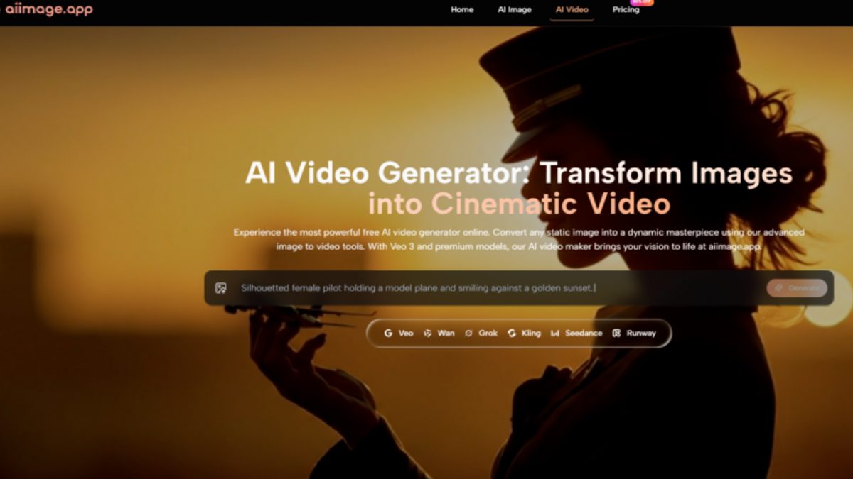
Last Thursday, my task list looked like three different jobs stitched together. By noon, I needed product-on-white shots for a tech accessories brand. By two, I had to produce whimsical editorial illustrations for a children’s literacy nonprofit. And, by four, a restaurant client wanted atmospheric interior vignettes that could pass for film stills. In the old days, I’d have booked three different freelancers or spent the week hunting through niche stock libraries. Now I had a single afternoon and a browser full of AI image platforms, each promising to handle multiple styles. What I discovered wasn’t that any single model could do everything — none could — but that the platform with the broadest, most easily switchable model roster saved me from context-switching hell. One AI Image Maker became the command center for that afternoon, and it reshaped how I think about creative tool selection.
Why Single-Model Platforms Stumble On Diverse Briefs
Many AI image tools market themselves around a signature aesthetic. One might be tuned for photorealism, another for digital art, another for concept sketches. That specialization is fine when your work stays inside a single visual lane. But the reality of freelance creative work is that Tuesday might demand an infographic-friendly illustration, while Wednesday requires a cinematic product hero shot. A platform built around a single model, or a single aesthetic default, forces you to either fight against its biases — spending extra prompt tokens to suppress what the model wants to do — or maintain accounts on four different platforms and remember which one does what.
The fragmentation cost is real. I’d find myself opening Platform A for photorealism, Platform B for illustration, Platform C when I needed text rendered cleanly, and then losing track of which credit balance belonged to which account. One afternoon of multi-style production made it clear that model variety, housed in a single interface with a shared image history, was more valuable to my workflow than any single model’s marginal quality advantage.
The Six-Platform, Three-Style Stress Test
I loaded the same three style briefs into six AI image platforms: photorealistic product shot with a specific shadow direction, hand-drawn children’s book illustration with a limited palette, and a moody restaurant interior with warm tungsten light and shallow focus. I gave each platform the same prompts and ran each prompt three times. And, I scored on style adherence, how many revisions were needed to get usable results across all three styles, and how much friction the platform added when switching between style contexts.
The comparison table below summarizes the afternoon’s performance, with scores out of 10 reflecting cross-style versatility rather than single-style peak quality.
| Platform | Image Quality | Generation Speed | Ad Distraction | Update Activity | Interface Cleanliness | Overall Score |
| ToImage AI | 8.1 | 8.5 | 9.4 | 9.0 | 9.5 | 8.9 |
| Midjourney | 9.0 | 7.3 | 9.7 | 8.3 | 6.7 | 8.2 |
| Leonardo AI | 8.4 | 7.9 | 7.2 | 8.7 | 7.5 | 7.9 |
| Adobe Firefly | 8.2 | 8.3 | 9.1 | 9.2 | 8.1 | 8.6 |
| Ideogram | 7.8 | 8.6 | 6.5 | 8.0 | 6.9 | 7.6 |
| Krea | 8.0 | 8.2 | 7.0 | 8.3 | 7.2 | 7.7 |
Midjourney’s restaurant interior was the single best image of the entire test — rich, textured, genuinely cinematic — but its children’s illustration felt stiff, as if the model was uncomfortable leaving its photographic comfort zone. Adobe Firefly handled the illustration brief surprisingly well, leveraging its training on a broad art corpus, but the product shot sometimes drifted into a slightly synthetic sheen. ToImage AI’s advantage wasn’t that it beat everyone at every style; it was that switching between styles required nothing more than changing the model dropdown next to the prompt box. The interface stayed the same, my prompt history stayed visible, and the model descriptions gave me enough guidance to route the restaurant brief to a more cinematic model and the illustration brief to a model that handled stylized output.
What Model Variety Felt Like In Practice
The moment that crystallized the afternoon’s lesson came around two-thirty, when I was deep in the illustration brief. My first few attempts on one model produced images that were too glossy, too digital. I switched to another model in the same interface — ToImage offers several, including GPT Image 2 for structure-heavy work and others for looser, more painterly output — and the next generation landed closer to the hand-drawn, soft watercolor feel I needed. I didn’t have to open a new tab, log into a different account, or re-type the prompt.
The Model-Routing Habit That Formed By Four O’Clock
Matching The Model To The Brief, Not The Brand
I started reading each prompt with a quick mental classification: is this asking for precision or atmosphere? If the image needed clean edges, readable text, or specific object relationships, I routed it to the structured model. If it needed mood, grain, and organic imperfection, I picked a different model. The platform’s model labeling was descriptive enough that I could make that call without consulting external documentation, and the ability to toggle models without losing my prompt text meant I could A/B test two aesthetic directions in under a minute.
The workflow steps were straightforward. I wrote a prompt covering subject, style, and intended mood. I selected a model that matched the desired output type. Also, I generated the image, evaluated it, and either downloaded it or switched models and regenerated. The afternoon’s success wasn’t about any single breakthrough generation; it was about never having to stop and re-learn an interface when the creative brief changed.
Where Model Variety Still Couldn’t Rescue Me
There were failures. The tech product brief included a request for a semi-transparent charging cable, and every model I tried rendered it as either fully opaque or weirdly glowing. The restaurant brief wanted a specific type of bar stool that none of the platforms seemed to have in their training data, and I eventually had to describe it generically and accept a close-enough approximation. Model variety helps distribute the risk of a single model’s blind spots, but it doesn’t eliminate the fundamental limitations of current AI generation. Some objects, materials, and spatial arrangements remain stubbornly out of reach regardless of how many models you can throw at the problem.
The Case For Choosing A Platform, Not A Model
The creative market is currently flooded with individual model releases, each accompanied by a wave of social media hype. It’s tempting to chase the newest model, sign up for yet another beta, and fragment your workflow further. My afternoon convinced me that the more durable investment is a platform that aggregates multiple models cleanly, keeps your generation history unified, and lets you route prompts to the right model without breaking your creative momentum. ToImage AI isn’t the only platform pursuing this aggregation strategy, but it’s the one where the integration felt most seamless during a high-pressure, multi-style production day. For the working creative whose briefs change hourly, that seamlessness is worth more than a single percentage point of photorealism.
Also Read: How Claude AI Is Changing Business Communication with Virtual Phone Numbers

Statutory Residence Test Guide: Sufficient Ties Test Explained
You need to know how HM Revenue and Customs looks at your physical presence and connections to the UK to…
What Is a Smart TV? Features, Benefits, How It Works & Buying Guide (2026)
What Is a Smart TV, Really? What is a smart tv, really? Honestly, I get why people ask this. I…